
You spent months building your website. The design is clean, the copy is sharp, and the product is genuinely good. So why are people still bouncing without buying — or worse, without even scrolling past the homepage?
The brutal answer? They don’t trust you.
And here’s what makes that so frustrating: most of the time, your visitors can’t even articulate why. Trust on the internet is built and broken in milliseconds. It operates below the level of conscious thought, governed by psychological principles that most website owners have never heard of, let alone applied.
This isn’t a post about adding a padlock icon or slapping a few testimonials on your homepage. This is about going deeper — understanding the actual cognitive and emotional machinery that fires inside your visitor’s brain when they land on your site, and why that machinery is silently telling them to leave.
The 50 Millisecond Problem: First Impressions Are Not What You Think
Researchers at Carleton University found that it takes just 50 milliseconds — half a tenth of a second — for users to form a visual opinion about your website. Published in the journal Behaviour & Information Technology by Lindgaard et al. (2006), the study confirmed that visual appeal can be assessed almost as quickly as the eye can take in information. By the time your visitor’s conscious mind has registered they’re on a new page, their gut has already rendered a verdict.
This is the halo effect in action. If the visual design feels cheap, cluttered, or dated, the brain automatically extends that feeling to the brand behind it. “If they can’t be bothered with their own website, what does that say about their product?” That thought never gets spoken — it doesn’t need to. It just quietly converts into an exit click.
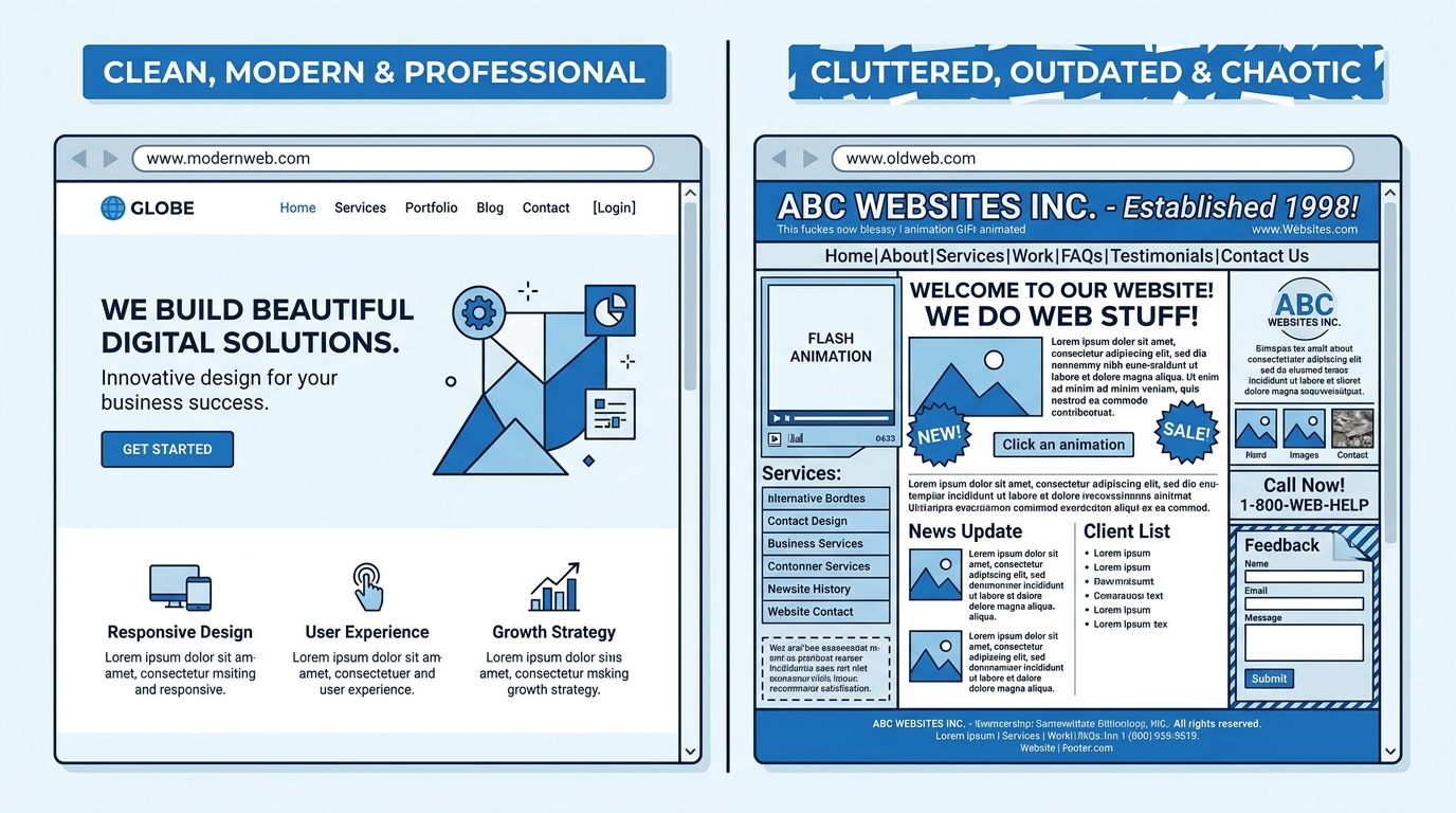
The deeper issue here isn’t just aesthetics. It’s alignment. When a website’s visual presentation doesn’t match the price point, the audience, or the promise being made, the brain registers inconsistency. Inconsistency triggers doubt. Doubt is the opposite of trust.
Ask yourself honestly:
- Does your website look like it belongs to a company that charges what you charge?
- Does the design feel consistent from page to page, or does it feel like it was assembled in pieces by different people over different years?
- Would a stranger landing on your homepage understand within three seconds who you are, who you help, and why they should stay?
Cognitive Fluency: If It’s Hard to Read, It’s Hard to Believe
Cognitive fluency is the psychological term for how easy or difficult it feels to process information. And here’s the uncomfortable truth: the harder something is to read, the less trustworthy it feels.
Studies have shown that statements presented in hard-to-read fonts are rated as less true than the exact same statements in clean, legible type. Your brain interprets the friction of processing as a signal that something is off. It conflates “this is hard to read” with “this doesn’t feel right.”
On a practical level, this shows up in a dozen small ways that most site owners overlook:
- Light grey text on a white background looks minimal and modern — and quietly exhausts your visitor’s eyes, making them want to stop reading.
- Paragraphs that run eight or ten lines long feel like walls of text, creating a subconscious sense of overwhelm before the reader has processed a single idea.
- Inconsistent spacing, misaligned elements, and poorly sized images send the same signal: this place is not well taken care of.
- Jargon-heavy copy that requires the reader to work hard just to understand what you do creates cognitive resistance — and cognitive resistance turns into distrust.
The fix isn’t to dumb things down. It’s to make comprehension effortless. When a visitor understands you immediately, they relax. Relaxation is a pre-condition for trust.
Social Proof Done Wrong Is Worse Than No Social Proof At All
Every website owner knows they need testimonials. So they collect a handful, pick the most flattering ones, and paste them on the homepage. Done, right?
Not quite. The human brain has evolved extremely sophisticated mechanisms for detecting authenticity. We spent thousands of years in small communities where spotting a liar was a survival skill. That instinct didn’t vanish when we moved online.
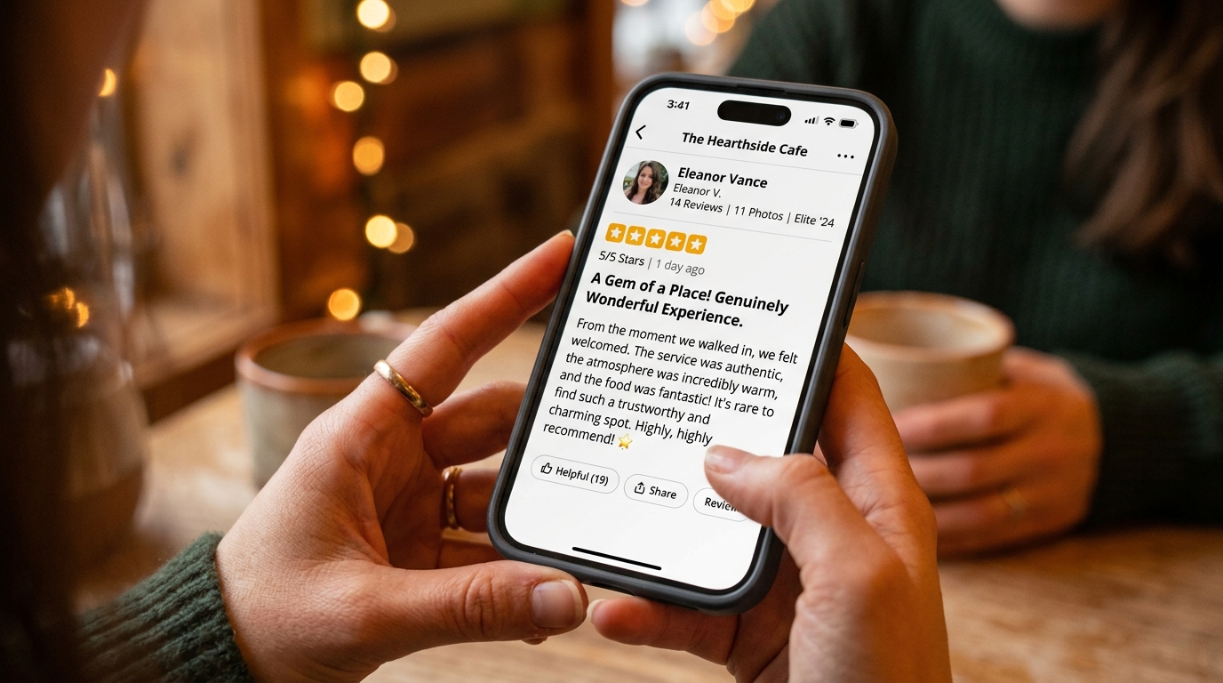
When visitors encounter testimonials that are too polished, too vague, or too uniformly positive, those ancient social radars start pinging. “Sarah M. — Chicago” accompanied by a generic stock photo and a five-sentence rave that sounds like it was written by a marketing team feels false. And false social proof is actively more damaging than none at all, because it suggests you’re willing to manipulate people.
Authentic social proof has these qualities:
- It’s specific. A review that mentions a particular result, feature, or moment in the customer journey feels real because it couldn’t be fabricated as easily.
- It includes friction. Real customer experiences have rough edges. A testimonial that acknowledges a minor concern before explaining why the customer is still happy is far more believable than one that reads as flawless.
- It’s attributable. Full names, photos that look like real people, job titles, company names, or links to verifiable profiles all dramatically increase perceived credibility.
- It scales with your claim. A startup claiming to have “thousands of happy customers” with only four testimonials visible creates a gap the brain notices and fills with suspicion.
Authority Signals: The Difference Between Looking Competent and Being Believed
Robert Cialdini’s research on the psychology of influence, published in his landmark 1984 book Influence: The Psychology of Persuasion, identified authority as one of the six fundamental principles that drive human decision-making. We are wired to trust people and institutions that demonstrate expertise.
The problem is that most websites attempt to assert authority rather than demonstrate it. There’s a significant psychological difference between the two.
“We are industry leaders with over 20 years of experience” is an assertion. It asks the visitor to take your word for it. “Featured in Forbes, The Wall Street Journal, and Fast Company” is a demonstration — because reputable third parties have already vouched for you.
Authority signals that actually move the needle include:
- Press coverage from recognizable outlets — even one mention in a credible publication can shift perception dramatically.
- Credentials, certifications, and awards from respected industry bodies.
- Detailed case studies that show your process, not just your results.
- A content library that demonstrates deep expertise — not “10 Tips” listicles, but original thinking that only someone with genuine expertise could produce.
- An “About” page that tells a real story, with real people, and a clear explanation of why this company exists and what it knows.
Without these signals, a visitor’s brain has nothing to anchor trust to. And a brain without an anchor defaults to caution.
The Transparency Paradox: Hiding Weaknesses Creates More Distrust Than Sharing Them
Here’s something that surprises most business owners: proactively disclosing a limitation or a drawback often increases trust rather than diminishing it.
Psychologists call this the pratfall effect, first studied by Elliot Aronson in 1966. His experiments showed that when highly competent people made a small, relatable mistake, they were rated as more likable and trustworthy — not less. The same principle applies to brands. When an otherwise credible business admits an imperfection, it comes across as more human, more honest, and paradoxically more trustworthy. The counterintuitive move is the honest one.
Most websites do the opposite. They present a frictionless fantasy where everything is perfect, results are guaranteed, and no reasonable person could possibly have a concern. Visitors see through this immediately. They’ve been burned before. They know that no product or service is perfect, so a brand that presents itself as such reads as evasive — which is the enemy of trust.
Radical transparency applied to your website might look like:
- Clearly stating who your product is NOT for. This is simultaneously disqualifying and credibility-building.
- Publishing your pricing, even when competitors don’t. Hiding prices triggers the same suspicion reflex as a salesperson who won’t tell you the cost until you’re committed.
- Addressing the top objections your customers have — on your own website, before they have a chance to leave and Google them.
- Writing an FAQ that includes questions people actually ask, including the uncomfortable ones.
Micro-Interactions and the Principle of Commitment: Small Asks Lead to Big Trust
Trust is not binary. It doesn’t switch from zero to full confidence the moment someone lands on your site. It builds incrementally, through a series of small interactions that each confirm your brand is safe to engage with.
This is why asking a cold visitor to immediately purchase a high-ticket item is psychologically catastrophic. The request far exceeds the trust that has been established. The brain’s risk assessment function kicks in, doubt floods the decision-making process, and the visitor leaves.
Cialdini’s principle of commitment and consistency suggests that people who make small initial commitments are far more likely to make larger ones later. Every micro-interaction on your website is an opportunity to build that commitment ladder:
- Clicking to read a blog post is a micro-commitment. Make sure the post delivers on its headline.
- Signing up for a free resource is a micro-commitment. Make sure the delivery experience is seamless and the resource is genuinely valuable.
- Starting a free trial is a micro-commitment. Make sure the onboarding doesn’t immediately overwhelm.
- Live chat, when staffed by a real human who responds quickly, is a trust accelerator that no chatbot can fully replicate.
Each positive micro-interaction deposits into a trust account. Each negative one makes a withdrawal. Most websites are unknowingly overdrawn.
The Mere Exposure Effect: Familiarity Is a Form of Trust
Robert Zajonc’s mere exposure effect — first formally published in his landmark 1968 paper “Attitudinal Effects of Mere Exposure” — is one of the most replicated findings in all of social psychology: humans develop a preference for things simply because they’ve encountered them before. Familiarity breeds comfort. Comfort enables trust.
This is why a consistent brand presence across multiple channels — social media, email, search, retargeting — dramatically increases conversion rates on your website. The person clicking through has already seen your name, your logo, your voice. Their brain has tagged you as familiar. Familiar means safe.
Within your website, the mere exposure effect also applies to design conventions. Your visitors have been trained by thousands of other websites to expect certain things: the logo in the top left, the navigation in the header, the call-to-action above the fold, the contact information in the footer. When these expectations are violated in the name of “creative” design, it creates disorientation. Disorientation is the opposite of trust.
Innovation in design should always serve familiarity of function. Push creative boundaries with your imagery, your writing, your color palette. Don’t push them with your navigation architecture.
Loss Aversion and the Risk Calculus Every Visitor Is Running
Behavioral economists Daniel Kahneman and Amos Tversky established through their 1979 prospect theory research that losses feel approximately twice as powerful as equivalent gains. Your visitor isn’t just evaluating what they could gain by buying from you. They’re running a constant, unconscious risk assessment of what they could lose.
Money. Time. Privacy. Status. Trust in their own judgment.
Every element of your website either reduces this perceived risk or amplifies it. Websites that fail to address risk head-on allow visitors to fill the uncertainty with their worst fears. That’s a game you always lose.
Effective risk reduction on your website includes:
- Money-back guarantees with clear, simple terms — not buried in fine print.
- Explicit statements about data privacy and what you will and won’t do with a visitor’s email address.
- Security badges on checkout pages from recognizable providers.
- No-obligation trial periods that remove financial commitment as a barrier.
- Clear and accessible refund and return policies that signal confidence in your product.
- A physical address and phone number — these still matter enormously to a brain calculating whether you’re real.
Dark Patterns: The Self-Inflicted Trust Wounds You Might Not Know You Have
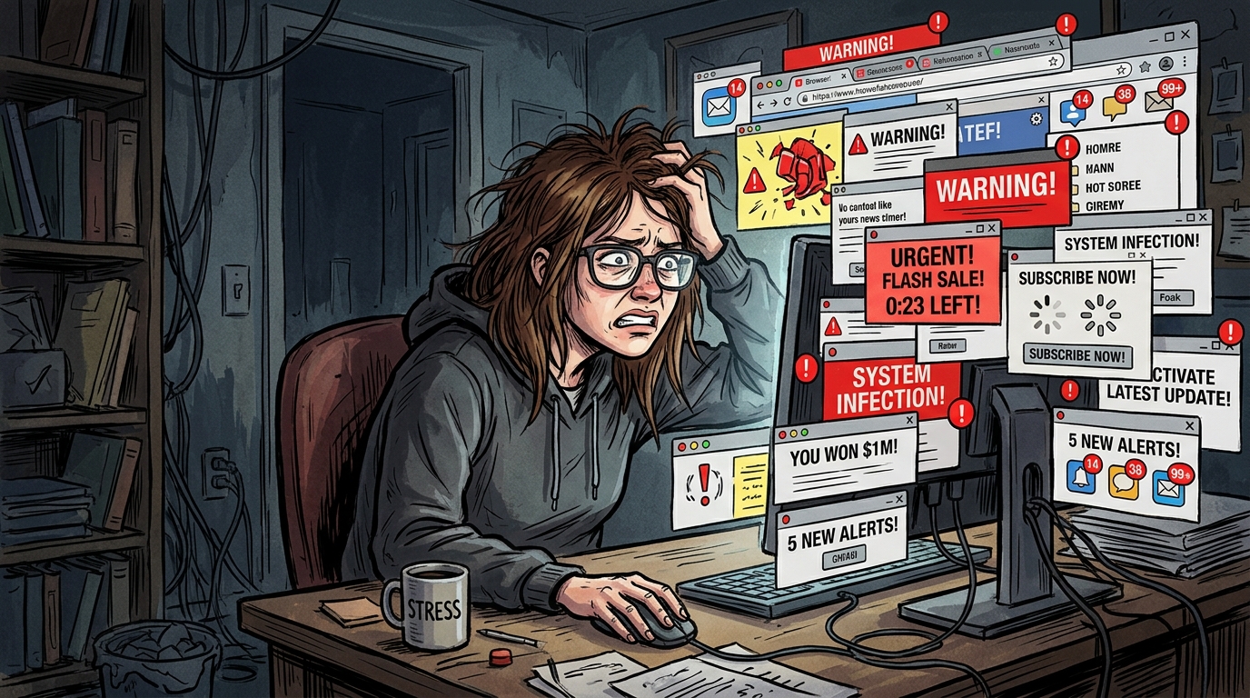
Some trust problems are baked into the design and copy choices businesses make without realizing the psychological damage they’re doing.
Pop-ups that appear before a visitor has read a single line of content signal desperation — and desperation is not a quality we associate with trustworthy brands. Countdown timers that reset every time you visit the page (a tactic that is shockingly common) are an explicit lie that any attentive visitor will catch. Auto-playing videos, especially with sound, are a violation of personal space that immediately sets the visitor on edge.
Then there are the subtler patterns. Opt-out pre-checked boxes. Subscription terms hidden in the fine print. “Special offers” that are always available. Urgency messaging that isn’t rooted in reality.
The modern internet user is sophisticated. They’ve seen these tactics hundreds of times. When they encounter them on your website, they don’t just feel irritated — they categorize you. You become the kind of brand that does that. And that categorization is extremely hard to reverse.
Do an audit of your website with this single question in mind: “Would I feel respected if I encountered this?” Be ruthless. Your visitors will be.
The Operational Trust Signal Nobody Talks About: Site Speed

Website speed rarely makes the list when people discuss trust signals. It should be near the top.
A slow website communicates neglect. It says this business doesn’t invest in its infrastructure, doesn’t respect its visitors’ time, and probably can’t be relied upon when it counts. That inference is unfair and often incorrect — but the brain doesn’t ask for fairness, it asks for signals.
Google’s own research found that the probability of a visitor bouncing increases by 32% when page load time goes from one to three seconds. Separate Google data confirms that 53% of mobile visitors abandon sites that take longer than three seconds to load. Even for visitors who stay, every moment of loading friction chips away at their willingness to engage.
A site that loads fast, navigates smoothly, and responds instantly to interaction creates a subconscious sense of competence and reliability. That sense is trust.
Brand Voice Inconsistency: The Subtle Trust Killer in Plain Sight
Trust, at its root, is the belief that something will behave predictably. Consistency is therefore not just a branding principle — it’s a psychological trust mechanism.
When your homepage copy is warm and conversational but your product descriptions read like they were written by a different company in a different decade, the brain registers the inconsistency. When your social media presence is one brand and your website is another, visitors who arrive via social feel disoriented. Disorientation reads as unreliability.
This extends beyond copy. If your imagery is high-end lifestyle photography on the homepage and low-resolution product shots on the product pages, the inconsistency signals a lack of attention to detail. And a company that doesn’t notice its own inconsistencies is likely to miss the ones that matter to the customer.
Consistent brands feel more trustworthy not because they’re better, but because predictability is a form of safety. The brain prefers the known.
Where to Start: Diagnosing Your Website’s Trust Deficit
Trust problems are rarely singular. They accumulate — each small signal compounding the others until the sum is a visitor who feels vaguely uncomfortable on your website without being able to say why. The good news is that the same compounding works in your favor when you fix the signals.
Start with a cold audit. Ask someone who has never seen your website to navigate it for five minutes, then answer three questions:
- What does this company do, and who is it for?
- What’s one thing that made you hesitate or feel uncertain?
- Would you feel comfortable entering your credit card details here? Why or why not?
The answers will be uncomfortable. That’s exactly the point.
Then work through the principles in this post systematically. Improve your visual clarity. Simplify your language. Humanize your social proof. Build your authority through demonstrated expertise rather than asserted claims. Eliminate the dark patterns. Speed up your site. Make your voice consistent from page to page.
The Bottom Line
Your visitors are not being unreasonable when they don’t trust your website. They’re being human. Trust is a deeply wired survival mechanism, and in the digital world, people have learned through painful experience to deploy it cautiously.
Your job isn’t to overcome that skepticism with pressure or persuasion. Your job is to eliminate the signals that are triggering it — and to build, systematically and deliberately, the kind of digital presence that feels safe to engage with.
When your website speaks to the psychology of trust rather than fighting against it, conversion isn’t something you chase. It becomes something that happens naturally, because you’ve made it psychologically inevitable.

