You’ve done the hard part. You got people to your website. The ads are running, the SEO is working, the social posts are landing. Traffic is coming in. So why aren’t the sales following?
The uncomfortable truth is that most ecommerce businesses lose the majority of their potential customers not at the ad stage, not at the homepage — but on the product page itself. That’s the make-or-break moment. It’s where intent meets reality, and where a small improvement can translate directly into a significant lift in revenue.
According to industry benchmarks, the average ecommerce conversion rate sits between 1% and 4%. That means for every 100 people who find your product, up to 99 of them leave without buying. Even moving that needle by a single percentage point can be the difference between a struggling store and a thriving one.
This guide breaks down the most impactful changes you can make to your product pages right now — no redesign required, no developer needed for most of them. Let’s get into it.
Table of contents
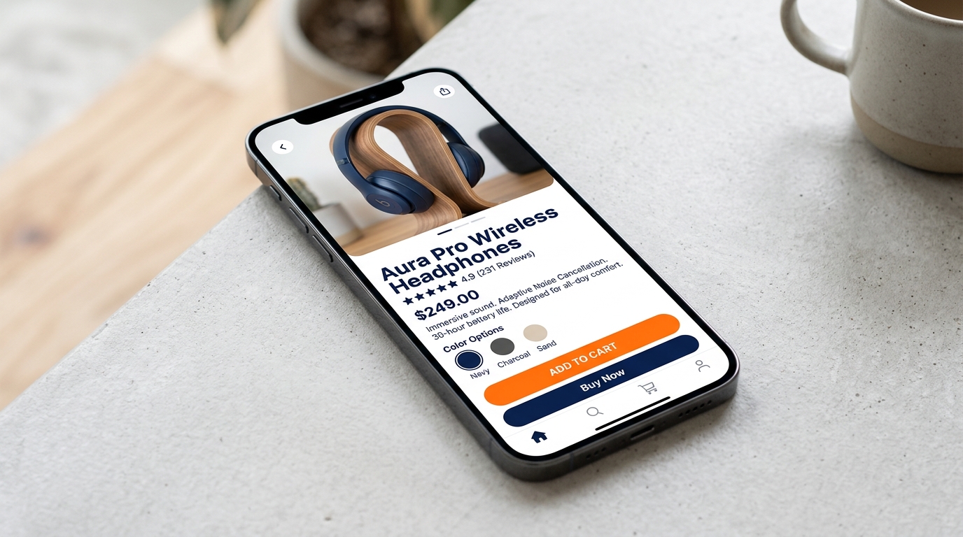
1. Lead With a Headline That Sells the Outcome, Not Just the Product
Your product title matters more than you think. Most product pages use the manufacturer’s name or a generic descriptor. That’s a missed opportunity. The best product headlines tell the visitor not what the product is, but what it does for them.
Compare these two:
“Stainless Steel Water Bottle, 750ml”
“Stay Hydrated All Day — 750ml Insulated Bottle That Keeps Cold for 24 Hours”
The second version answers the visitor’s real question: what’s in it for me? That tiny shift in framing can meaningfully improve time-on-page and reduce bounce rates.
Quick tip: Think about the primary problem your product solves. Lead with the solution, not the specs.
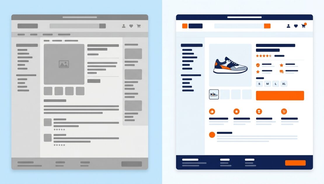
2. Your Product Photos Are Either Selling or Scaring People Off
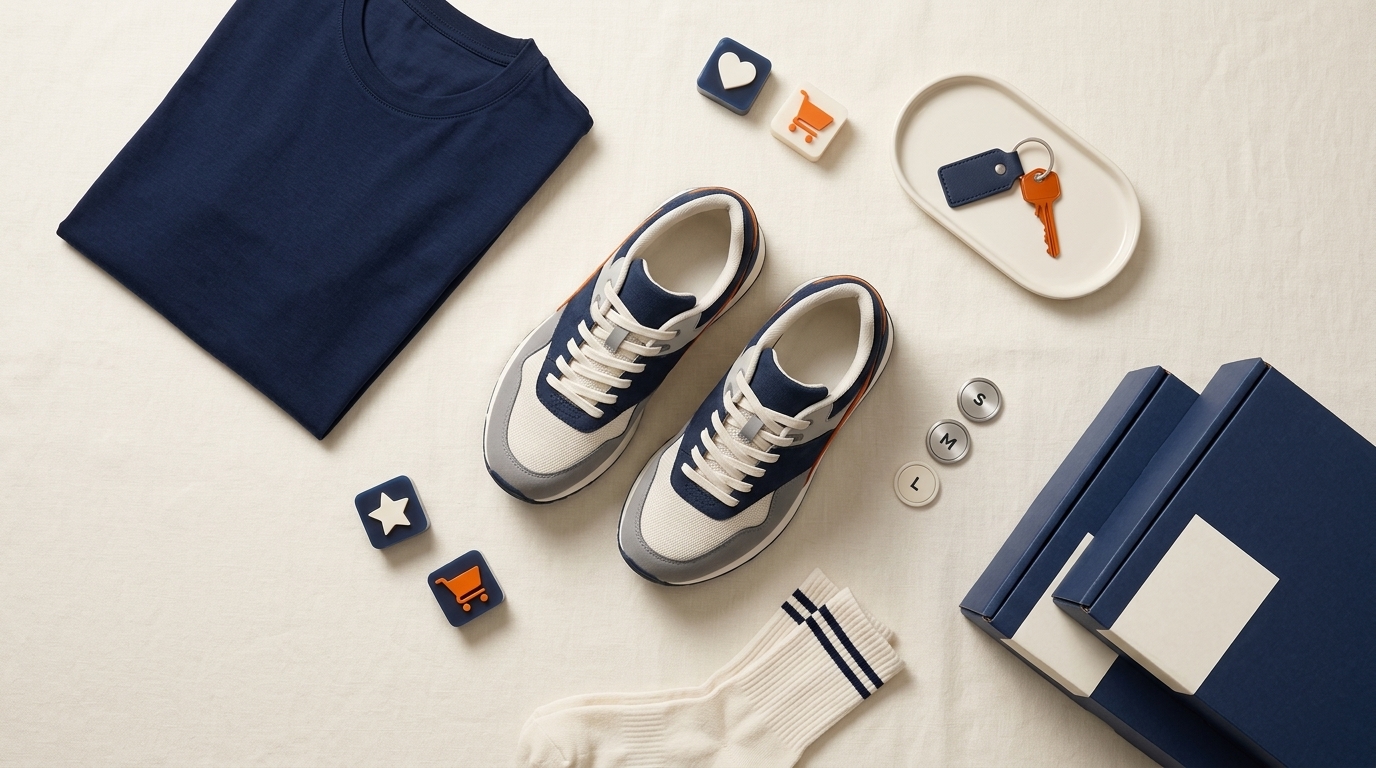
Photography is doing heavy lifting on your product page. Online shoppers can’t pick up the item, feel the texture, or try it on. Your images are the closest thing they have to a physical experience — which means poor photos aren’t just an aesthetic issue, they’re a trust issue.
Here’s what high-converting product pages consistently do well:
Multiple angles and contexts — show the product in use, not just on a white background
Lifestyle imagery — help the visitor picture themselves using it
Scale reference — give the eye something familiar to compare size against
Zoom capability — especially important for texture, detail, and quality-sensitive products
Video — even a simple 15-second product video can significantly increase time on page and purchase confidence
If budget is a constraint, a modern smartphone and good natural light will outperform a low-effort studio setup every time. Authenticity converts.
3. Write Product Descriptions That Convert, Not Just Describe
Most product descriptions read like a spec sheet. They list features in bullet points and stop there. The problem? Features don’t sell — benefits do.
When writing your product copy, follow this simple formula: feature → benefit → emotional payoff. Here’s an example for a pair of running shoes:
Feature: Lightweight foam midsole
Benefit: Reduces fatigue on long runs
Emotional payoff: So you finish strong instead of limping to the finish line
Structure your description to answer the three questions every visitor is quietly asking: What is this? What will it do for me? Why should I trust that it works?
Keep paragraphs short. Use subheadings to break up detail sections. Write in the language your customer uses — not marketing language, not technical jargon. If your customers say ‘easy to clean’, don’t write ‘effortless maintenance’.
SEO note: Naturally weave your focus keywords into the first 100 words of your product description. This helps Google understand the page’s intent without keyword stuffing.
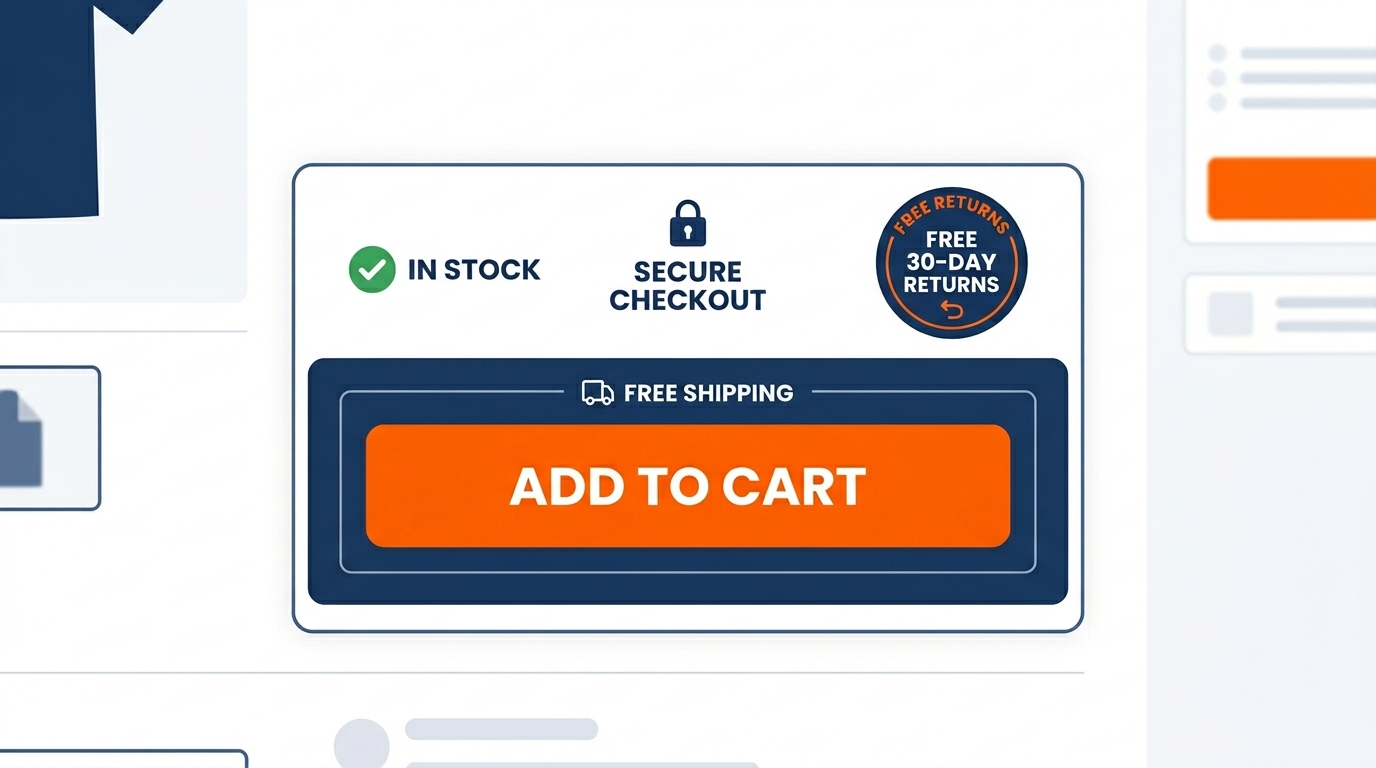
4. Make Your Call-to-Action Button Impossible to Miss
Your Add to Cart or Buy Now button is the single most important element on the page. It should be the first thing a visitor’s eye is drawn to after the product image and title.
High-converting CTA buttons share a few key traits:
Strong contrast against the page background — it needs to stand out visually
Action-driven language — ‘Add to Cart’, ‘Get Yours Today’, ‘Buy Now’ outperform vague labels like ‘Submit’ or ‘Continue’
Above the fold — don’t make people scroll to find it on desktop
Repeated — include the CTA again below the product description for long pages
Surrounded by micro-reassurances — small icons or lines like ‘Free shipping’ or ‘Easy returns’ directly near the button reduce friction at the moment of decision
Button color psychology matters too. Warm tones like orange and red naturally draw the eye and create urgency. Navy and green signal trust and reliability. Test what works for your audience.
5. Use Social Proof Strategically — Not Just Decoratively
Testimonials and reviews aren’t a ‘nice to have’. They’re one of the most powerful conversion tools on a product page. Research consistently shows that the majority of consumers check reviews before making a purchase — often before they read a single word of your product description.
But there’s a right way and a wrong way to do this. Vague five-star reviews with no detail (‘Great product! Would recommend!’) are almost as useless as no reviews at all. What converts is specific, credible social proof.
Here’s what to prioritize:
Detailed reviews that mention the problem they had before and how the product solved it
Reviews with photos or videos from real customers
A star rating displayed prominently near the product title — not buried below the fold
‘Most helpful’ or ‘verified purchase’ labels to signal authenticity
Negative reviews (yes, really) — a product with only five-star reviews reads as curated and triggers distrust
If you don’t have many reviews yet, start collecting them actively. A simple post-purchase email sequence asking for feedback (not a generic review request, but a genuine one) can build your review library quickly.
Bonus: User-generated content — photos and videos your customers post on social — can be repurposed on product pages as some of the most authentic social proof available.
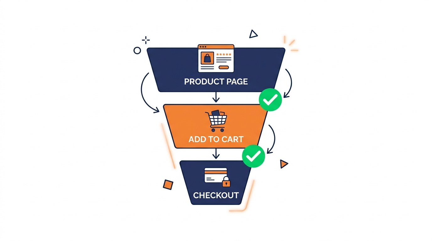
6. Remove Friction at Every Step of the Purchase Journey
Friction is anything that makes a visitor pause, think, or hesitate. On a product page, friction kills conversions. The goal is to make saying yes as easy as humanly possible.
Common friction points to audit and eliminate:
Slow page load speed — every additional second of load time reduces conversion probability. Google recommends pages load in under 2.5 seconds
Forced account creation — offer guest checkout as the primary option
Hidden shipping costs — reveal delivery costs early, not at checkout. Unexpected costs at checkout are the number one cause of cart abandonment
Confusing size or variant selectors — if someone can’t figure out which option to pick, they’ll pick nothing
Sparse or unclear returns policy — feature it on the product page, not just buried in the footer
Every extra click, every form field, every unanswered question is a leak in your conversion funnel. Walk through your own purchase journey as if you were a first-time visitor. You’ll find friction you didn’t know was there.
7. Build Trust With Signals That Speak Louder Than Words
Trust is the invisible currency of ecommerce. Visitors who don’t trust you won’t buy — regardless of how good the product is or how competitive the price. The challenge is that trust is formed (and destroyed) before the visitor has consciously decided to evaluate it.
These are the trust signals that consistently move the needle on product pages:
SSL certificate and HTTPS — the padlock in the browser bar is noticed subconsciously even when visitors don’t consciously check for it
Recognized payment logos — displaying Visa, Mastercard, PayPal, Apple Pay icons directly on the product page normalizes the transaction
Security and guarantee badges — money-back guarantee seals, secure checkout badges, and recognized certifications reduce perceived risk
Clear contact information — a real phone number or live chat widget signals that a real business stands behind the product
About and story elements — brief brand story snippets woven into or adjacent to the product page create human connection
Also consider the subtler signals: professional photography, consistent spelling and grammar, coherent brand voice, and pages that load quickly. These don’t scream ‘trust us’ — they quietly demonstrate it.
Brand insight: Outreach Brands works with businesses to ensure that every touchpoint — from visual design to page copy — sends a consistent, credible signal that converts visitors into confident buyers.
8. Optimize for Mobile — Because That's Where Most of Your Buyers Are
More than half of all ecommerce traffic now comes from mobile devices. Yet many product pages are still designed with desktop as the primary experience and mobile as an afterthought. That’s a conversion-killing mismatch.
A mobile-optimized product page means:
Thumb-friendly CTA buttons — large enough to tap without pinching and zooming
Images that scale correctly without distortion or horizontal scrolling
Readable font sizes — minimum 16px for body text
Sticky Add to Cart bar that follows the user as they scroll
Streamlined navigation — mobile visitors have less patience; reduce clutter ruthlessly
Test your product pages on a real device, not just in a browser resize window. The experience is different, and the gaps in your mobile UX will become immediately obvious.
9. Use Urgency and Scarcity — But Only When They're Real
Urgency and scarcity are powerful psychological triggers. The fear of missing out is a genuine driver of purchasing decisions. When handled honestly, these tactics work. When manufactured artificially, they destroy trust.
Legitimate urgency tactics that convert:
‘Only 3 left in stock’ — only display this when it’s actually true
‘Order in the next 2 hours for same-day dispatch’ — if your fulfillment supports it, this is highly effective
Limited-time offers with a real end date — countdown timers work when they’re tied to genuine promotions
’12 people are viewing this right now’ — use cautiously and only if accurate; visitors have become sceptical of fake social proof counters
The key word is ‘real’. Fake countdown timers that reset on page reload, perpetual ‘sale ends tonight’ banners, and fabricated low-stock warnings are all patterns that savvy shoppers have learned to distrust. Once trust is broken, it’s very hard to recover.
10. Test, Measure, and Iterate — Conversion is a Process, Not a Project
Here’s the honest truth about conversion rate optimization: there is no single magic change that will fix everything. What works for one brand and one audience may not work for another. The businesses that consistently improve their conversion rates are the ones that treat optimization as an ongoing discipline, not a one-time task.
Start with the highest-impact changes first — your CTA button, your photography, your page load speed. Then build a habit of testing:
A/B test one element at a time — headline vs. headline, button colour vs. button colour — so you know exactly what moved the needle
Use heatmaps and session recordings to see exactly where visitors are scrolling, clicking, and dropping off
Track micro-conversions — add to cart clicks, image gallery interactions, time on page — not just final purchases
Review your checkout funnel analytics regularly; many conversions are lost after the product page, and those leaks need fixing too
Even a modest improvement in conversion rate compounds significantly over time. A product page converting at 2% instead of 1% doubles your revenue from the same traffic. That’s the power of getting this right.
If you’re not sure where to start, a professional website audit can identify exactly which elements of your product pages are holding your conversions back — and prioritize them by potential impact.
Ready to Turn More Visitors Into Buyers?
Product page optimization isn’t about tricks. It’s about understanding what your visitors need to feel confident enough to say yes — and then giving them exactly that at every step.
From the headline to the hero image, from the CTA button to the returns policy, every element either builds or erodes that confidence. The businesses that get this right consistently outperform their competitors on the same traffic budgets.
At Outreach Brands, we help businesses build product pages and digital experiences that convert — through smart strategy, proven UX principles, and data-driven execution. Whether you need a full website optimization or targeted improvements to your highest-traffic pages, we’re ready to help.
For more information about Outreach Brands’ forward-thinking digital marketing services, complete the online request form below.