I know you have spent time and money on the website. There is a problem. Over half of the visitors are looking at the website on a smartphone. If my mobile experience is frustrating I am installing a trap door. That trap door instantly loses customers and the trap door hurts my Google ranking (Mobile‑first design is critical for SEO). It is not about coding. I will show the three hidden mobile website mistakes that small businesses often make. The mobile website mistakes involve design and setup. I have seen many small businesses struggle with these issues. You can spot the mobile website mistakes. You can fix the website mistakes yourself in under thirty minutes.
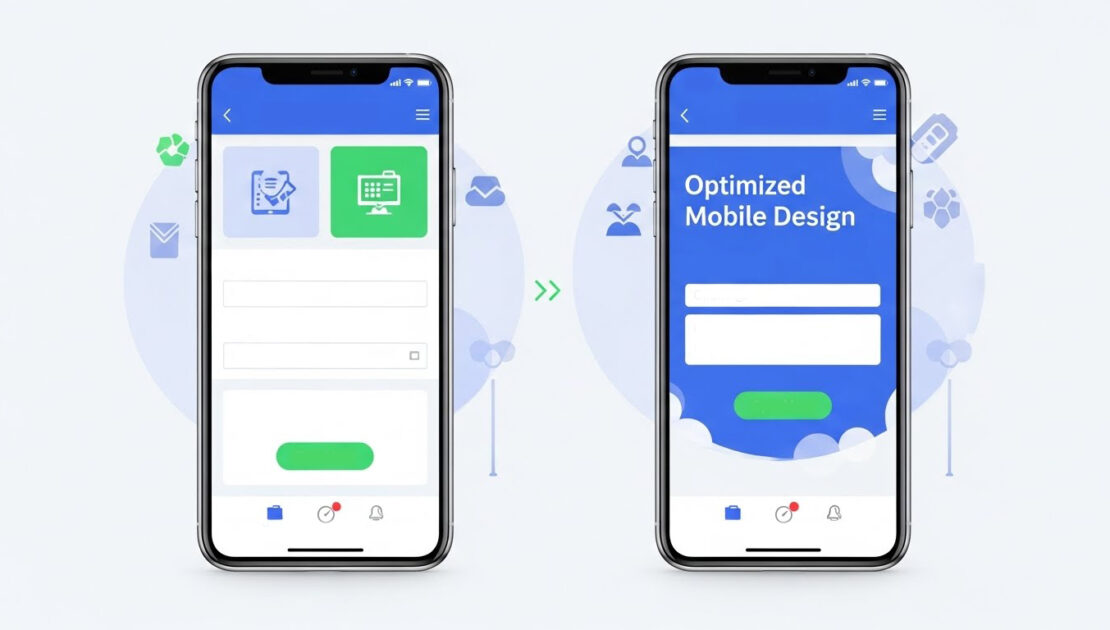
3 Mobile Mistakes Killing Your Small Business Sales
05
Dec
Posted by: outreachbrands
Category:
Digital Marketing, Web Development
No Comments
Mistake #1: The Tiny Tap Targets (It's Annoying Customers)
You can think about using your phone by touching it with your thumb because your thumb is large.
The Problem: Your “Contact Us” or “Buy Now” buttons look perfect on a desktop, but on a mobile device, they are tiny or jammed too close to other links. This forces your customer to tap repeatedly, zoom in, or just give up out of frustration. This poor mobile website user experience (UX) is a prime driver of high mobile bounce rates.
🛠️ The 10-Minute Fix: Give Your Buttons Room to Breathe
- Use the “Thumb Test”: The “Thumb Test” allows website usability evaluation through phone-based usability testing sessions. You should be able to tap your three essential buttons (Request Quote, Add to Cart, Menu) without touching any surrounding elements on your phone screen.
- Ensure a Minimum Size: The minimum touch target size should measure at least 48 pixels according to industry guidelines. Buttons that are smaller than this size become difficult to press correctly.
- Actionable Step: You need to reach out to your web host or platform manager to explore options for increasing button padding which will improve the spacing between important call-to-action buttons. The addition of extra space between buttons leads to fewer user errors and produces better conversion rates.
Mistake #2: The Scroll-Forever Signup Form
Your goal is to get a lead, but you’re making your customer work too hard.
The Problem: I see that the ten field desktop lead form now sits on the site. On a phone the form looks like a wall of text that never ends. Typing on a screen is tedious. When a potential customer sees that effort the potential customer abandons the form. The form discourages sales by asking for too soon.
🛠️ The 15-Minute Fix: Less Is More (Especially on Mobile)
- Essential Information Only: The initial contact requires only two pieces of information which are Name and Email address. You can obtain company size and budget information through a subsequent email after starting the conversation.
- Smart Fields: The system needs to use dropdown menus and radio buttons instead of open text fields for every possible situation. Users need to tap once through their mobile devices instead of typing at a slow pace to access the system.
- Actionable Step: The system should use multi-step forms for user interaction. The long form contains three brief sections which users can find through (Step 1: Contact Info; Step 2: Project Details). The system runs at high speeds because users face no significant mental obstacles.
Mistake #3: Hiding Your Money-Making Pages
If your customers can’t find it easily, they won’t buy it.
The Problem: Businesses use the mobile header to maintain cleanliness by placing their vital pages including Pricing, Services, and Portfolio under the standard hamburger menu icon (three lines). The sales process becomes more difficult because visitors need to tap multiple times to access your primary service page.
🛠️ The 5-Minute Fix: Promote Your Power Pages
- Identify Your Top 3 Pages: What are the three most important pages that drive revenue or inquiries?
- Pin the Essentials: Put the three links, outside the hamburger menu right in the header or, in the footer of the mobile site. A Call Now button or a Services link that stays visible when the menu is closed are examples. I find it helpful to keep the three links visible.
- Actionable Step: Use a Sticky Header or Footer. Keep your navigation—the links that bring you money—fixed at the top or bottom of the screen while the user scrolls. Sticky Header or Footer gives the user a path to conversion all the time. Make sure the navigation stays in place.
Turn Mobile Mistakes Into Marketing Wins
Fixing these three development and design-related mobile website mistakes is the fastest, non-coding way to see an immediate boost in your mobile SEO and conversions. When you show Google that you prioritize the user experience, you get rewarded with better rankings.
Ready to move beyond these quick fixes and build a fully optimized, high-converting mobile presence? Our Website Optimization services are designed to turn your website into your best salesperson.
For more information about Outreach Brands’ forward-thinking digital marketing services, complete the online request form below.

