Ever wonder why fast food giants lean so heavily on red, or why nearly every bank in the world wraps itself in blue? That’s not coincidence. It’s strategy. Color psychology in branding is one of the most powerful—and most underutilized—tools in a marketer’s playbook. Get it right, and your palette does the selling before a single word is read.
In 2025, with consumers more digitally aware and visually sophisticated than ever, the colors your brand wears carry serious weight. Let’s break down how they work, what the data says, and how you can build a palette that converts.
Here’s a number worth bookmarking: research suggests that up to 93% of consumers make an initial product judgment based on visual appearance alone—and color is the dominant factor in that split-second decision. Before your headline lands, before your value proposition registers, your color palette is already communicating.
And consumers are listening.
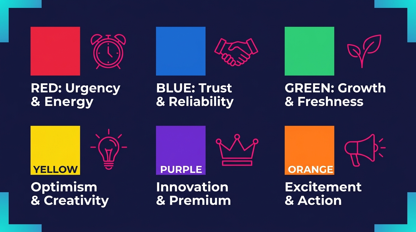
Red signals urgency—think clearance sales and fast food. Blue builds trust—it’s the backbone of finance, tech, and healthcare branding. Yellow radiates optimism—IKEA has owned that association for decades. These aren’t accidents. They’re the result of deliberate, psychology-informed choices by brands that understand how the human brain processes color as emotion.
A 2023 study published in the Journal of Business Research found that red increased impulse purchasing behavior in e-commerce environments, while green measurably elevated perceptions of sustainability and brand authenticity among eco-conscious consumers. The takeaway? Color doesn’t just look good—it performs.
Every color carries a psychological payload. Here’s how the major hues translate into consumer perception—and where each one earns its place in a brand strategy.
Red activates attention fast. It spikes heart rate, creates a sense of excitement, and drives urgency. Sales environments and food brands use it effectively—but overuse tips into aggression. Deploy it for CTAs and limited-time offers, not as a foundational tone.
Blue is the trust architect. It communicates calm, reliability, and professionalism, which is why it dominates tech, finance, and healthcare. If your brand needs to earn credibility quickly, blue is doing heavy lifting on your behalf.
Green speaks the language of health, nature, and growth. For eco-focused brands, wellness companies, and sustainable businesses, it’s a natural fit. The caveat: it only works when the brand authenticity backs it up. Greenwashing in green is spotted quickly.
Yellow is the optimist. Cheerful and youthful, it grabs attention with ease—but at high saturation, it fatigues the eye. Use it as an accent that energizes, not a dominant tone that overwhelms.
Purple carries quiet authority. Luxury, creativity, and spirituality live in this space. Brands like Cadbury have built long-standing premium associations through consistent use of purple.
Orange bridges the energy of red with the friendliness of yellow. It communicates enthusiasm, warmth, and approachability—a strong choice for brands that want to feel bold but not intimidating.
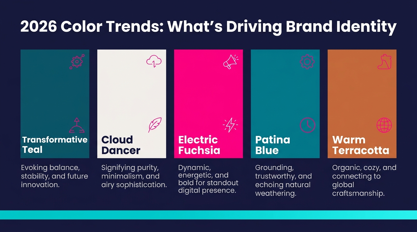
The most closely watched shift in 2026 isn’t toward louder palettes—it’s toward intentional ones. According to Yellow Duck Marketing, in a world defined by saturation and visual overload, Pantone’s 2026 Color of the Year embraces restraint. Cloud Dancer (PANTONE 11-4201) is a soft, weightless white designed to bring clarity, calm, and renewal—stripping away excess and letting simplicity take center stage.
But restraint doesn’t mean retreat. As Adobe’s color trend report highlights, trend forecasting platform WGSN—partnering with Coloro—has named Transformative Teal as their Color of the Year for 2026: a fusion of dependable dark blue and aquatic green that’s both grounded and futuristic, representing sustainability, change, and ecological awareness.
The broader blue and teal family is emerging as a dominant color story for 2026. Envato’s cross-platform trend analysis points to Etsy tapping Patina Blue—a molten blue with a green undertone inspired by copper’s natural aging process—as its Color of the Year, further cementing teal’s grip on the design landscape.
At the bolder end of the spectrum, VistaPrint’s 2026 color research identifies the “Neon Shock” trend gaining serious momentum: electric greens, acid yellows, and hot pinks used as precise accents against muted or industrial foundations—not flooding designs with fluorescent color, but deploying it like punctuation. Bold. Controlled. Impossible to ignore.
The Marketing Machine rounds out the picture: expect deeper color stories overall, with flat and overly bright palettes giving way to earth tones, warm neutrals, and layered hues gaining traction across health, finance, and lifestyle sectors.
The strategic takeaway for 2026: pair a grounded, nature-connected base—teal, sage, Cloud Dancer white—with one precisely placed electric accent. That tension between calm and energy is the defining visual language of the year.
Picking brand colors isn’t a creative exercise—it’s a strategic one. Here’s how to approach it with intention:
Start with your audience. Who are you speaking to? Thrill-seekers respond to red and orange. Wellness-focused consumers gravitate toward green and soft blue. B2B decision-makers trust navy and charcoal. Your palette should mirror the emotional world your audience already lives in.
Audit your competitive landscape. What colors own your category? Now ask: where’s the white space? If every player in your industry is dressed in blue and gray, a confident orange or vibrant magenta CTA can make you the most memorable brand in the room.
Test before you commit. A/B testing CTA button colors alone has been shown to move conversion rates by double digits. Run tests. Let data, not instinct, finalize the palette.
Think culturally. Colors don’t carry universal meanings. White signals purity in many Western markets but carries associations of mourning in parts of Asia and Latin America. If you’re operating across borders, cultural context isn’t optional research—it’s essential.
Define your system precisely. As BrandCloud’s 2026 brand color guide makes clear, once your palette is selected, lock in precise color values—HEX, RGB, CMYK, and Pantone formats—to ensure your brand reproduces consistently across every medium. Most brands don’t fail because they chose the wrong colors. They fail because they use them inconsistently.
The most successful brands don’t just pick a color—they commit to it until it becomes synonymous with who they are.
Coca-Cola’s red and silver pairing delivers energy and nostalgia simultaneously—a combination so embedded in consumer memory that the brand is instantly recognizable at a glance. Spotify’s vibrant green projects freshness, boldness, and digital confidence. It says “contemporary” without saying a word. As one analysis noted, Spotify’s steady, unwavering use of a single green has proven that a simple, consistent color system can carry an entire brand.
Even at a local scale, color drives tangible results. A coffee shop that replaced neutral beige walls with warm orange saw measurable foot traffic improvements—because the environment communicated something it hadn’t before: warmth, energy, and welcome.
These aren’t flukes. They’re the compounding return on deliberate color investment.
The most successful brands don’t just pick a color—they commit to it until it becomes synonymous with who they are.
Coca-Cola’s red and silver pairing delivers energy and nostalgia simultaneously—a combination so embedded in consumer memory that the brand is instantly recognizable at a glance. Spotify’s vibrant green projects freshness, boldness, and digital confidence. It says “contemporary” without saying a word. As one analysis noted, Spotify’s steady, unwavering use of a single green has proven that a simple, consistent color system can carry an entire brand.
Even at a local scale, color drives tangible results. A coffee shop that replaced neutral beige walls with warm orange saw measurable foot traffic improvements—because the environment communicated something it hadn’t before: warmth, energy, and welcome.
These aren’t flukes. They’re the compounding return on deliberate color investment.
Use this before locking in any brand color decision:
☐ Identified the primary emotion you want consumers to feel
☐ Researched competitor palettes to find differentiation opportunities
☐ Validated color choices against your core target audience’s preferences
☐ Reviewed 2026 trend directions for category relevance
☐ Checked cultural implications for all target markets
☐ Defined a primary color, one to two accent colors, and neutral foundations
☐ Documented HEX, RGB, CMYK, and Pantone codes in a formal brand style guide
☐ Set up A/B tests for high-stakes applications like CTA buttons and landing pages
☐ Confirmed accessibility—sufficient contrast ratios for readability compliance
Color psychology in branding isn’t a soft concept—it’s a conversion mechanism. Every hue you place in front of a consumer is communicating something. The only question is whether it’s saying what you intend.
Audit your current palette. Ask whether your colors match your brand’s promise, your audience’s emotional world, and where 2026’s strongest visual trends are heading. Then test, refine, and commit. The brands winning on visual identity aren’t guessing—they’re engineering perception, one intentional color at a time.
Transform your brand’s visual presence from an afterthought into your sharpest competitive advantage.
For more information about Outreach Brands’ forward-thinking digital marketing services, complete the online request form below.